Navigating with Ease: Enhancing Care Manager Efficiency
UX Designer I UX Researcher I Platform


The Challenge: Navigating a Complex System
Imagine being a care manager responsible for multiple healthcare assessments daily. Each completed assessment might trigger additional ones, yet there was no immediate way to identify them. Instead, care managers had to wait for manual notifications from their supervisors—often delaying crucial follow-ups for days.
The Problem:
-
Frustration due to delayed notifications
-
Inefficient multi-platform switching
-
Slower healthcare processes
Goal:
Streamline the workflow, reduce delays, and empower care managers with the right tools to navigate their tasks effortlessly.
My Role: UX Designer
-
Team: Product Owner, Developers, UX Designers, UX Researcher
-
Company: Centene Corporation
-
Tools: Figma, FigJam, Jira, Google Meet, Miro, Confluence
-
Project Duration: 4 Weeks
Understanding the Roadblock
Care managers like Sarah Jackson—our primary user persona—needed a better way to access triggered assessments and needs. The existing workflow forced her to constantly switch between multiple platforms and rely on managerial updates, making her job unnecessarily time-consuming.
My Game Plan

Research &
Problem-Solving
-
Partnered with the Product Owner to define the feature’s purpose and business impact.
-
Ensured the solution addressed both immediate pain points & future scalability.
Ideation &
Design
Cross-Functional Collaboration
-
Worked with developers to identify technical constraints.
-
Engaged with UX researchers to validate design decisions through usability testing.
Iterative Design &
Feedback
I explored multiple wireframe concepts focusing on:
-
Prioritization: Should assessments be sorted by score or urgency?
-
Information Display: What’s the clearest way to present relevant data?
-
Navigation: Should the workflow be linear or flexible?
-
Refined the navigation experience through multiple iterations.
-
Ensured care managers could instantly see triggered assessments and navigate to them seamlessly.
Evolution of the Design
01
Proto-Persona

Sarah Jackson
Occupation: Care Manager
Age: 45
Location: New Orleans, LA
About:
Sarah is a Care Manager using the TrueCare Cloud platform to conduct assessments for members enrolled in programs like Medicare and Medicaid, aiming to understand their healthcare-related and daily living needs. However, she frequently faces challenges in knowing what the completed assessment triggered additional assessments and/or needs.
Goals:
-
A better way to learn what additional assessments and/or needs that need to be completed.
-
Save time by efficiently accessing and managing assessment results and related information.
"Knowing what additional assessments and needs are triggered from the assessment I just completed would give me the ability to provide timely and targeted support to our members."
Challenges:
-
Difficulty navigating through the platform to access trigger assessments or needs.
-
She needs to wait for her manager to share what assessments or needs were triggered.
02
User Flows
Current Flow:

Before:
-
Complete an assessment.
-
Return to the landing page.
-
Wait for the manager to notify triggered assessments.
-
Navigate to the IMPR platform to address the new assessments.
New Flow:

After (Optimized Workflow):
-
Complete an assessment.
-
Instantly see triggered assessments and needs.
-
Click directly into them for immediate follow-up.
Key Improvement: Eliminated unnecessary delays & steps for a more efficient workflow.
03
Sketches & Wireframes
My goal for this design is to give Sarah the ability to:
-
Identify the triggered assessments or needs.
-
View the overall score of the completed assessment.
-
Understand what triggered these assessments or needs.
I explored several questions and considerations that are crucial for refining and optimizing Sarah's experience which are:
-
Should assessments be displayed alphabetically, by priority, or by score?
-
Is it helpful to indicate what triggered each assessment?
-
Should only the title of the assessment be clickable for navigation to the tasks that need completion?
-
Should I include pagination for the triggered element scroll to manage larger volumes of triggered assessments?
Sketches:

Wireframes:


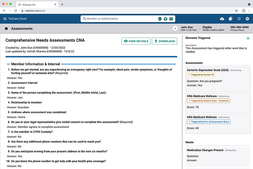
The image above displays different solutions for the right navigation on the completed assessment view screen, arranged from left to right. I have selected the first option as the ideal solution for the problem, considering its benefits for Sarah.
-
The first option is crafted to provide Sarah with information about the triggered element, including what triggered it and the associated score.
-
The second option focuses on informing Sarah about the triggered elements. To access the assessments or needs, she will need to navigate either to the landing page or the IMPR platform.
-
The third option offers a link to the assessments and needs along with its name.
First Iteration:
Users clicked on cards to access triggered assessments.
Second Iteration:


Offering Sarah the ability to directly navigate to the specific question that triggered the assessment provides a better user experience. Additionally, including the 'play' button for navigating to the triggered assessment is more user-friendly compared to clicking on the card.
Final Iteration:
3


Placing navigation on the left side improved usability, allowing Sarah to review completed assessments on the right while accessing triggered elements on the left.
Key Features:
-
Fixed 'Assessments' and 'Needs' tabs for easy access while scrolling.
-
Seamless switching between tabs for improved efficiency.
-
Separate scrolling for navigation and PDFs to keep things organized.
-
Clickable ‘play’ buttons for direct access to triggered assessments.
04
Usability Test
I collaborated with a UX researcher to conduct usability testing with:
-
1 Care Manager I
-
2 Care Manager IIs
-
1 Utilization Manager (formerly a Care Manager)
Key Insights & Adjustments

Prioritization: Users wanted triggered elements sorted by urgency and score.

Visual Cues: Clear indicators for completed vs. pending assessments.

Efficiency: Added a ‘Back to Top’ button for easy navigation.
Data Consistency: Pre-populated responses from previous assessments.
These insights shaped the final design, ensuring it truly supported care managers' daily workflows.

05
Hi-Fidelity Prototype: A Seamless Experience

Sarah now has:
-
Instant access to triggered elements post-assessment
-
Effortless navigation between assessments & needs
-
Clear visibility of triggered element scores
-
Independent scrolling for enhanced flexibility
Looking Back & Moving Forward
Leading this project reinforced the importance of:
-
User advocacy: Always design with real users in mind
-
Collaboration: Working closely with cross-functional teams.
-
Iteration: Adapting designs based on real-world feedback.
Next steps include:
-
Implementing usability test insights into future iterations.
-
Updating the platform for a smoother user experience.
-
Ensuring a seamless developer handoff for efficient implementation.
Final Thoughts
Knowing that this feature will significantly improve care managers' efficiency is incredibly rewarding. This project honed my leadership, collaboration, and problem-solving skills—reminding me why I love designing experiences that truly impact people’s lives.