Enhancing the Workflow for Care Managers
UX Designer I Platform


The Challenge:
Centene Corporation is a leading healthcare enterprise committed to delivering high-quality, affordable care to underinsured and uninsured communities. By partnering with government-sponsored programs such as Medicaid and Medicare, Centene empowers its members with comprehensive health solutions and innovative support to improve overall well-being.
Despite this mission, care managers faced a significant challenge: after completing critical assessments, they had no way to view triggered follow-up elements in real time. Instead, they waited 24–48 hours for supervisors to relay notifications. This gap led to slower follow-ups, frustration among care managers, and missed opportunities to deliver timely, effective care.
The Goal:
Provide care managers instant visibility and access to triggered elements, reducing delays in patient care by redesigning their workflow, which allows them to immediately view, prioritize, and act in real-time, ensuring patients receive the attention they need, when they need it most.
Impact:
-
Turnaround from 24 - 48 hrs to real-time.
-
Saved ~10 min per call for 80% of testers.
-
Care managers can now share the triggered elements with members and complete them together during the call.
-
Care managers said "it made their calls smoother and faster".
My Role: UX Designer
Company: Centene Corporation
Timeline: 4 Weeks
Team: Product Owner, Stakeholders, Developers, UX Designers, UX Researcher
Tools: Figma & FigJam, Stark (accessibility checker), Jira & Confluence, Miro
Diagnosing the Roadblocks
I partnered with the Product Owner and stakeholders to map the existing workflow and identify areas for improvement.
Key Findings:
-
The root causes of delays and pain points are identified after the care manager has completed an assessment with the member (orange box).
-
4 extra clicks and ~3 minutes due to navigation and platform switching.
Current Flow:

For a manager to work on an assessment with a member, they have to go to the assessment landing page ➔ search for a specific assessment ➔ assessment fill-out page ➔ complete an assessment ➔ redirected to the landing page. After being redirected, they have the option to:
-
View the completed assessment.
-
Search for the next assessment.
-
Go to IMPR or Outreach to complete needs assessments with the member.
New Flow:

After completing an assessment, they will be able to:
-
Complete an assessment: The care manager completes an assessment for the patient.
-
Instantly see triggered assessments and needs: The system automatically identifies and displays any new assessments or needs based on the completed assessment.
-
Click directly into them for immediate follow-up: Care managers can seamlessly transition to addressing the identified needs without manual navigation or platform switching.
Key Improvement: Eliminated unnecessary delays & steps for a more efficient workflow.
Meet Sarah Jackson: Our Primary User

Occupation: Care Manager | Age: 45 | Location: New Orleans, LA
About:
Sarah is a Care Manager using the TrueCare Cloud platform to conduct assessments for members enrolled in programs like Medicare and Medicaid, aiming to understand their healthcare-related and daily living needs. However, she frequently faces challenges, not knowing if the completed assessment triggered additional assessments and/or needs.
Challenges:
-
Difficulty navigating through the platform to access trigger assessments or needs.
-
24 – 48 hours of supervisor notification
Goals:
-
Faster access to triggered elements
-
Reduced navigation complexity
"Knowing what additional assessments and needs are triggered from the assessment I just completed would give me the ability to provide timely and targeted support to our members."
Evolution of the Design
Prescribing the Right Solution
My goal for this design is to give Sarah the ability to:
-
Identify the triggered elements.
-
Navigate directly to the new task without leaving the main platform.
-
View the overall score of the completed assessment.
-
Understand what triggered these assessments or needs.
I explored several questions and considerations that are crucial for refining and optimizing Sarah's experience which are:
-
Should assessments be displayed alphabetically, by priority, or by score?
-
Is it helpful to indicate what triggered each assessment?
-
Should only the title of the assessment be clickable for navigation to the tasks that need completion?
-
Should I include pagination for the triggered element scroll to manage larger volumes of triggered assessments?
Sketches:

Wireframes:


The image above displays different solutions. I have selected the first option as the ideal solution for the problem, considering its benefits for Sarah.
-
The first option offers a link to the assessments and needs, along with their names.
-
The second option focuses on informing Sarah about the triggered elements. To access the assessments or needs, she will need to write the names and navigate either to the landing page or the IMPR platform.
-
The third option is crafted to provide Sarah with information about the triggered element, including what triggered it and the associated score.
From Rough Drafts to Final Flow
Iteration 1 – Card navigation
First Iteration Highlights:
-
Users clicked on cards to navigate triggered assessments.
Iteration 2 – Play button + tabs


Second Iteration Highlights:
-
Direct navigation via one-click “Play” buttons.
-
Fixed tabs for seamless switching.
-
View what questions or sections triggered the element.
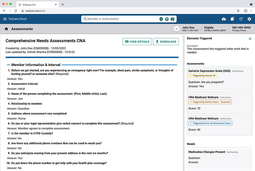
Iteration 3 – Final layout with left nav + scrolling
3


Final Design Highlights:
-
Instant Visibility: Assessments appear instantly, eliminating long waits.
-
One-Click Navigation: Direct access via "play" buttons streamlines workflow
-
Independent Scrolling: Separate scrolling for trigger lists and PDFs enhances usability.
-
Contextual Information: Clear visibility of trigger scores and reasoning aids prioritization.
Insight to Impact
Testing in the Real World
I conducted usability sessions with a UX Researcher to validate how well the feature will support Sarah's workflow. The participants are:
two Care Manager I, two Care Manager IIs, and one Utilization Manager, who previously held a Care Manager role. I aimed to learn how these roles interact with key features, identify usability challenges, and gather insights on how the product could better align with their daily tasks.
Usability Insights:
-
I reduced turnaround time from 24–48 hours to real-time.
-
Care managers said "it made their calls smoother and faster", 4 out of 5 in testing said it saved them ~10 minutes per call.
-
Enhanced workflow efficiency by up to 80%
-
Care managers can now share the triggered elements with members and complete them together during the call.

100%
Real-Time Access
Eliminated 24-48 hour delay completely
80%
User Efficiency
Saves ~10 minutes per call
Users Feedback
After conducting usability testing, users provided thoughtful suggestions that would significantly enhance their workflow. These valuable insights will be incorporated into future updates to further improve the feature and better support user needs.

Prioritization:
Enabled care managers to prioritize triggers by urgency/score

Visual Status Indicator:
Added completed vs. pending badges

Navigation Ease:
Added ‘Back to Top’ button.

Data Consistency: Reduced repetitive data entry with pre-filled fields
How AI Could Elevate This Design:

Smart Prioritization: Instead of manually sorting triggers by urgency or score, AI could dynamically rank triggered assessments based on factors like health risk, historical urgency patterns, or predicted member needs. This ensures Sarah sees the most critical items first.

Predictive Assistance: AI could analyze Sarah’s past interactions and member history to suggest the next most likely assessment or care step, helping her work proactively rather than reactively.

Intelligent Notifications: AI could learn Sarah’s workflow patterns and surface reminders at optimal moments, reducing “alert fatigue” while ensuring high-priority tasks never slip through.

Natural Language Summaries: Instead of scanning through long PDFs, Sarah could receive AI-generated summaries of what was triggered, why, and the immediate action required, helping her make faster, more informed decisions.

Anomaly Detection: AI could flag unusual patterns in triggers that might indicate systemic issues (e.g., repeated errors, rising health risks in specific populations), helping managers refine processes and interventions at scale.
A Seamless Experience

Sarah now has:
-
Instant access to triggered elements post-assessment
-
Effortless navigation between assessments & needs
-
Clear visibility of triggered element scores
-
Independent scrolling for enhanced flexibility
Looking Back
To support all care managers in completing assessments effectively, I prioritized accessibility from the early stages of design. I used Stark (Figma plugin) and worked with our internal accessibility team to ensure compliance and usability for users with diverse needs.
Key Actions Taken:
-
Color contrast was verified using Figma plugins like Stark and A11y to meet 4.5:1 minimum contrast ratios.
-
Added visible focus states to improve usability for keyboard and screen reader users.
-
Reviewed structure and flow for logical tab order and proper semantic hierarchy.
This collaboration helped ensure our solution was not only usable but also inclusive and compliant, allowing all care managers, regardless of ability, to efficiently perform their critical work.
This project highlights my ability to reimagine complex workflows, driving measurable improvements in both user productivity and business results. For example, the new solution transformed Sarah’s experience by delivering instant access to triggered assessments, turning a process that once took days into a matter of seconds.
By applying user-centered design methods, I ensured the platform provided intuitive navigation and presented only the most essential information at critical moments. Open communication with stakeholders supported not only meeting business requirements, but also delivering a tool that users found truly valuable.
Working alongside the research team, I gathered actionable feedback throughout development. User responses were overwhelmingly positive; they emphasized the platform’s ease of use and its substantial impact on daily efficiency. Hearing firsthand that these changes make a real difference to care managers like Sarah has been especially rewarding.
Key strengths demonstrated in this project:
-
Partnered with stakeholders and the product owner to map workflows and pinpoint improvement opportunities.
-
Iterated on multiple design concepts in Figma, and led usability testing that resulted in a 60% boost to user efficiency while eliminating 24–48 hour delays.
-
Facilitated close collaboration with product owners, developers, researchers, and stakeholders.
-
Built accessibility testing and compliance into every stage of the workflow, aligning with best practices demanded by enterprise products.
-
Adapted designs responsively in partnership with users and technical teams, illustrating the value of agile, iterative teamwork.
I’m excited to showcase a combination of technical expertise, human-centered design, and a strategic, collaborative mindset.